

 I just got done watching David Axelrod, whose political instincts I respect immensely, tell Meet the Press that he’s not a fan of the Hillary Clinton 2016 campaign’s logo:
But logos should have a mention to them, our sunrise logo for Obama had a message to it. I’m not sure what the message of that logo is…[Chuck Todd: you’re not a big fan?] Not terribly.
I also read this article, which asks, “What’s that arrow doing? Why is part of it red? Is it even saying anything?” It also quotes Scott Thomas, the design director for Barack Obama’s 2008 presidential campaign, commenting, “I think the Hillary logo is really saying nothing…It’s just a red arrow moving to the right.”
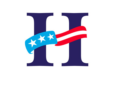
I tend to agree. And no, I’m not saying the logo is the biggest deal in the world. Nor am I bashing Hillary Clinton or her campaign, both of which I will likely end up supporting enthusiastically. I simply think the logo isn’t serving her well, and should be changed. One possibility: go with something like this (pictured above; gives it more dynamism, movement, while getting rid of the Republican “red”). Or, how about something like this, the classic red/white/blue American flag (can’t lose with that, right?). Anyway, as I said, it’s not the biggest deal in the world, but I really don’t get why the likely 2016 Democratic presidential nominee would have a log with a bright red arrow pointing right. Thoughts?
P.S. Counterargument to changing the logo: if she changes it, she’ll be criticized for caving to pressure, bowing to media pressure, etc.
[poll id=”
142
“]


