This morning, NPR reported on a new tool “to drill down to more local data” on the COVID-19 pandemic.
This week a team led by researchers at Harvard came up with a rating tool with four tiers: The highest “red” alert level — triggered if a location has more than 25 new cases per day per 100,000 people — means the virus is spreading to such a degree that evidence suggests the only way to get a handle on it is to revert to stay-at-home mode. At this stage even less drastic measures such as massively ramped-up testing and contact tracing probably won’t cut it.
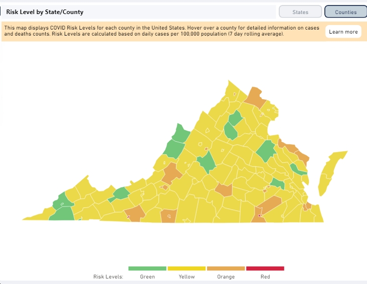
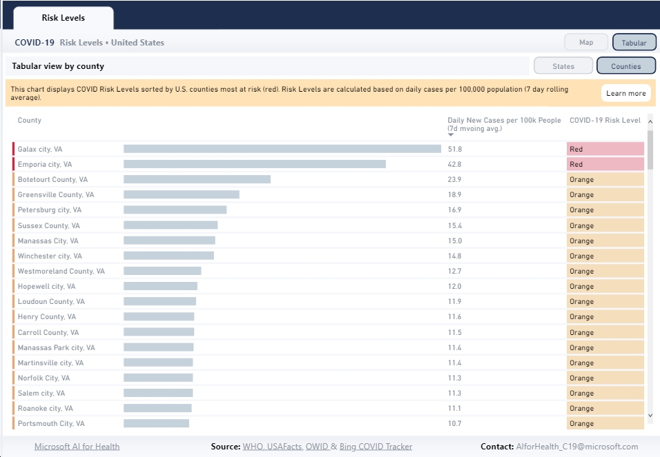
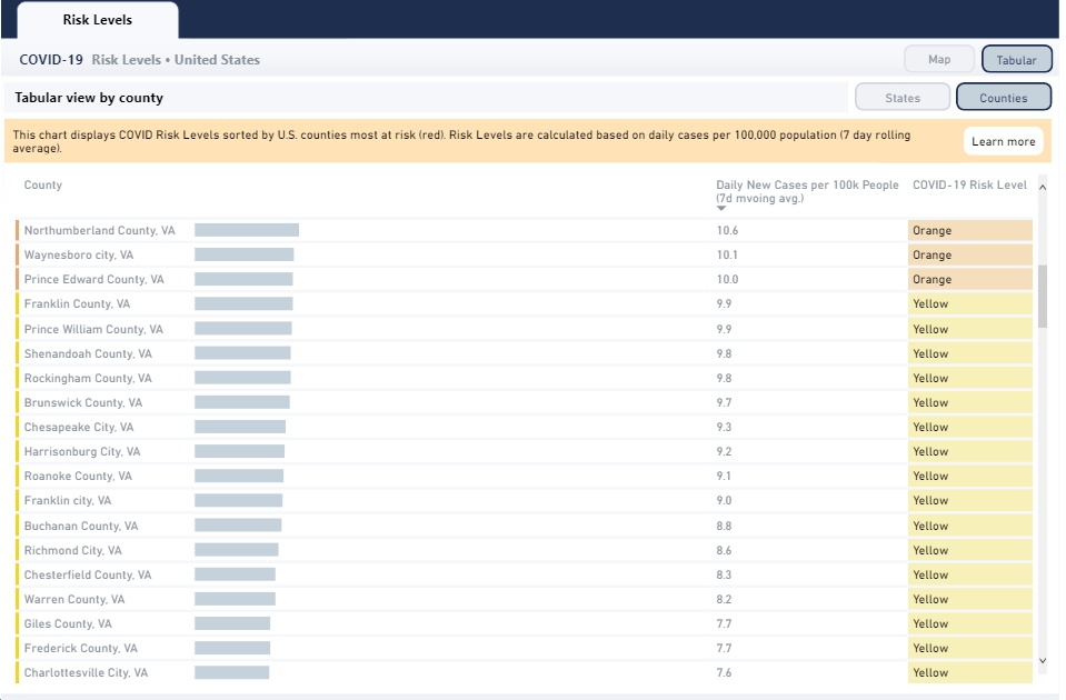
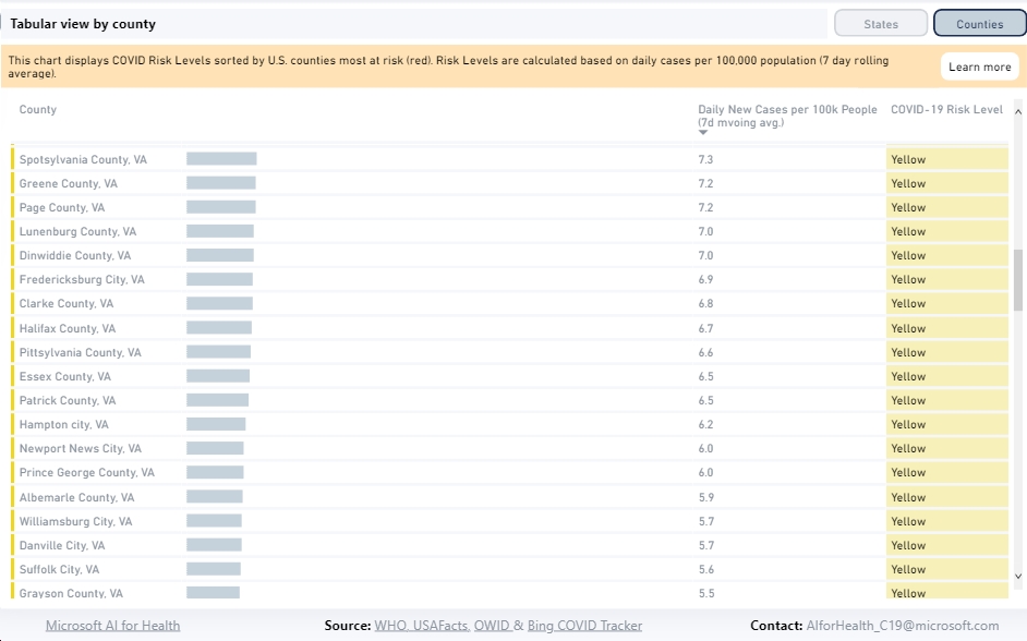
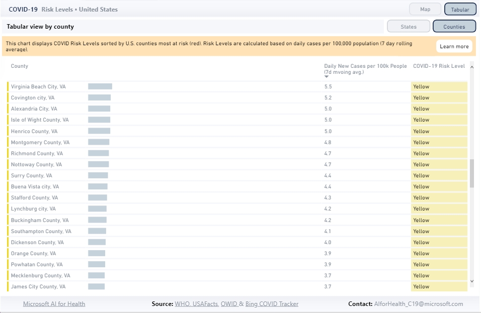
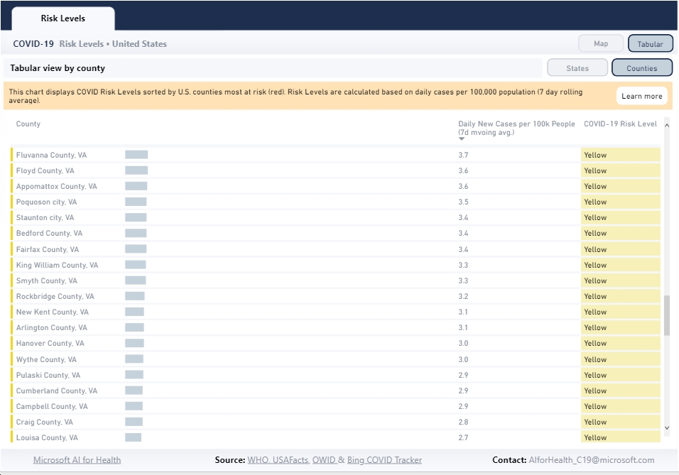
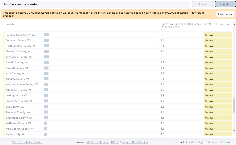
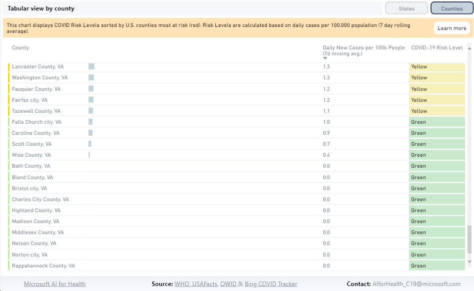
Click here to check out the tool, including a chart that “displays COVID Risk Levels sorted by U.S. counties most at risk (red),” including here in Virginia. Also, see below for the Virginia counties, sorted by risk level from highest (red) to medium (yellow) to lowest (green). As you can see, most of Virginia is in the “yellow” zone, with only Galax City and Emporia City in the “red” zone, only 20 jurisdictions in the “orange” zone, and only 14 jurisdictions in the “green” zone. Among the largest Virginia jurisdictions, Fairfax County is “yellow,” Virginia Beach is “yellow,” Loudoun County is “orange,” Prince William County is “yellow,” Arlington County is “yellow,” Henrico County is “yellow,” Richmond City is “yellow,” Norfolk is “orange,” Roanoke City is “orange,” Albemarle County is “yellow” and Charlottesville is “yellow.” Check them all out, below…

