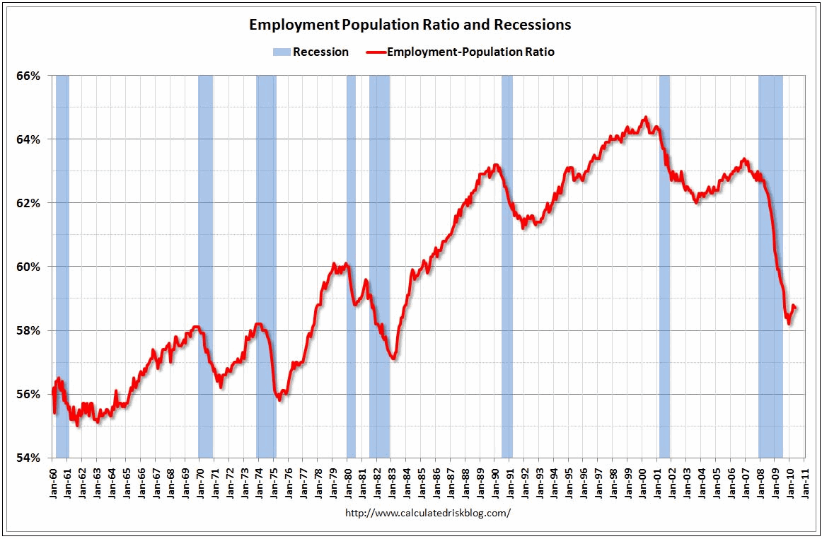
All of us know friends and /or family who have lost their jobs, students who graduated from college jobless, and too many who have been looking and looking for work for months. These graphs illustrate a frightening trend and puts our jobs crisis in shocking clarity.
This first graph shows the ratio of employed Americans to the adult population. At the start of the current recession (highlighted in blue), this figure plummeted showing the sharp decrease in employed Americans as the economy rapidly shed jobs.
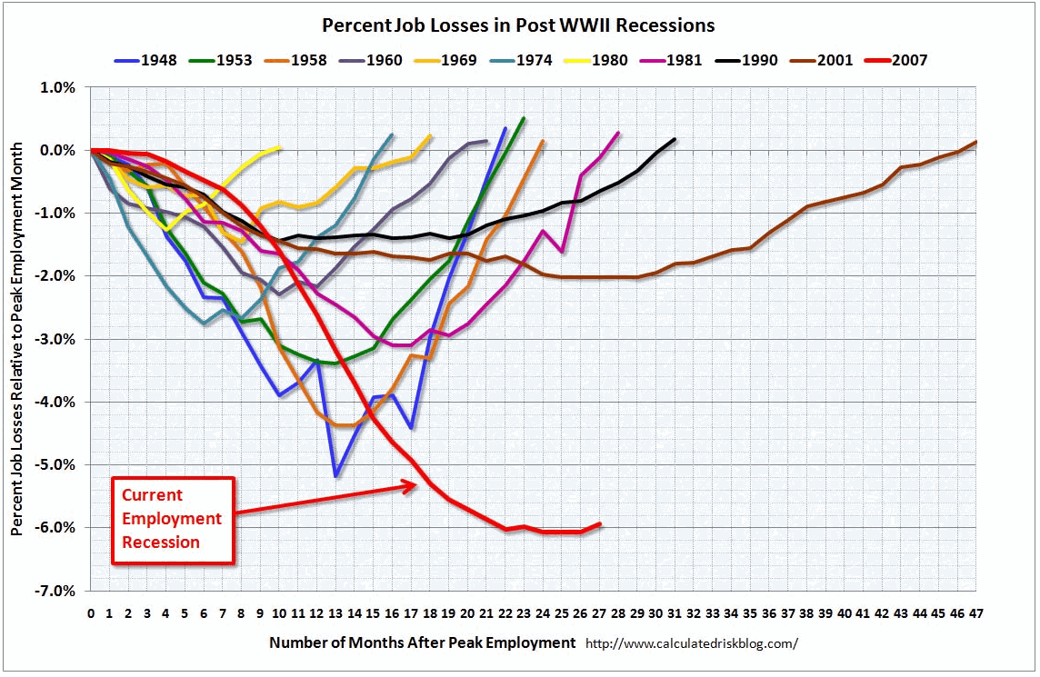
This next graph compares this recession to previous recessions by percent job losses.
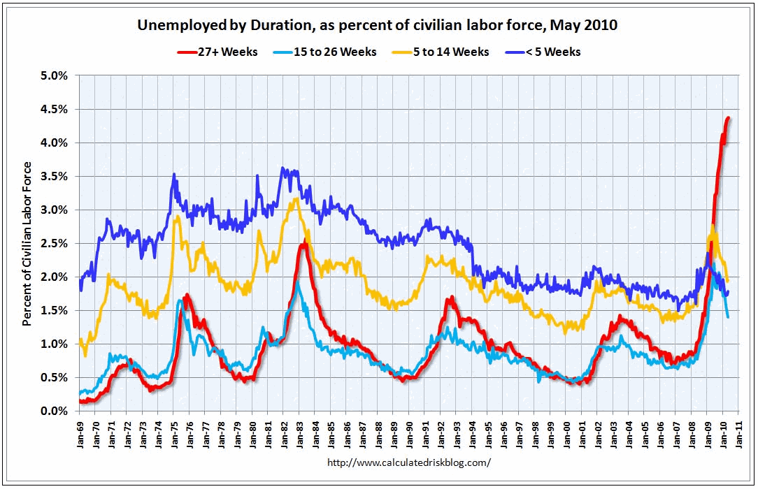
Graph #3 highlights the frightening percentage of unemployed workers who have been out of work for over 27 weeks or more. In May 2010, there were a record 6.763 million people unemployed for 27 weeks or more, or a record 4.38% of the labor force. This is drastically higher than during previous recession periods.
As the AP reports:
The proportion of people jobless for six months or more has accelerated in the past year and now makes up 46 percent of the unemployed. That's the highest percentage on records dating to 1948. By late summer or early fall, they are expected to make up half of all jobless American
Graphs from Calculated Risk blog.

![[UPDATED with Official Announcement] Audio: VA Del. Dan Helmer Says He’s Running for Congress in the Newly Drawn VA07, Has “the endorsement of 40 [House of Delegates] colleagues”](https://bluevirginia.us/wp-content/uploads/2026/02/helmermontage.jpg)


