It’s really fascinating to see how Virginia’s political geography has changed over time. To see this visually, check out the following maps (by Barry, J. Miles Coleman and the NY Times). I’ll add other maps if/when I see them, but for now…
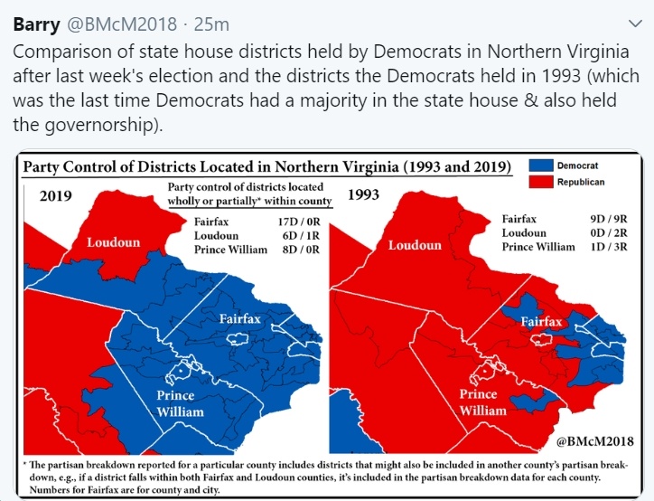
- The first maps show party control of districts located in Northern Virginia in 1993 compared to 2019. As you can see, in 1993, the Northern Virginia outer suburbs were almost pure “red,” whereas today it’s a see of blue in Arlington County, Alexandria, Fairfax County, Prince William County and much of Loudoun County (also, heading into Stafford County and Fauquier County).
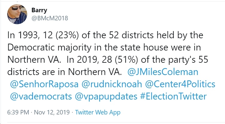
- As the following tweet explains, in 1993, only 12 out the Democrats’ 52-district House of Delegates majority (23%) were from Northern Virginia, whereas today it’s 51% (28 out of 55 districts).
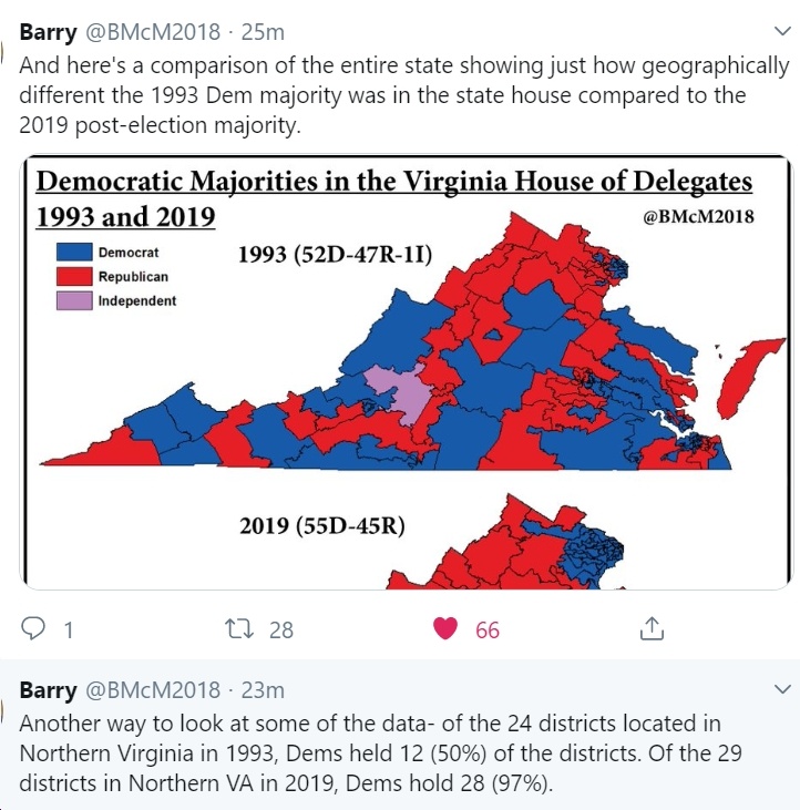
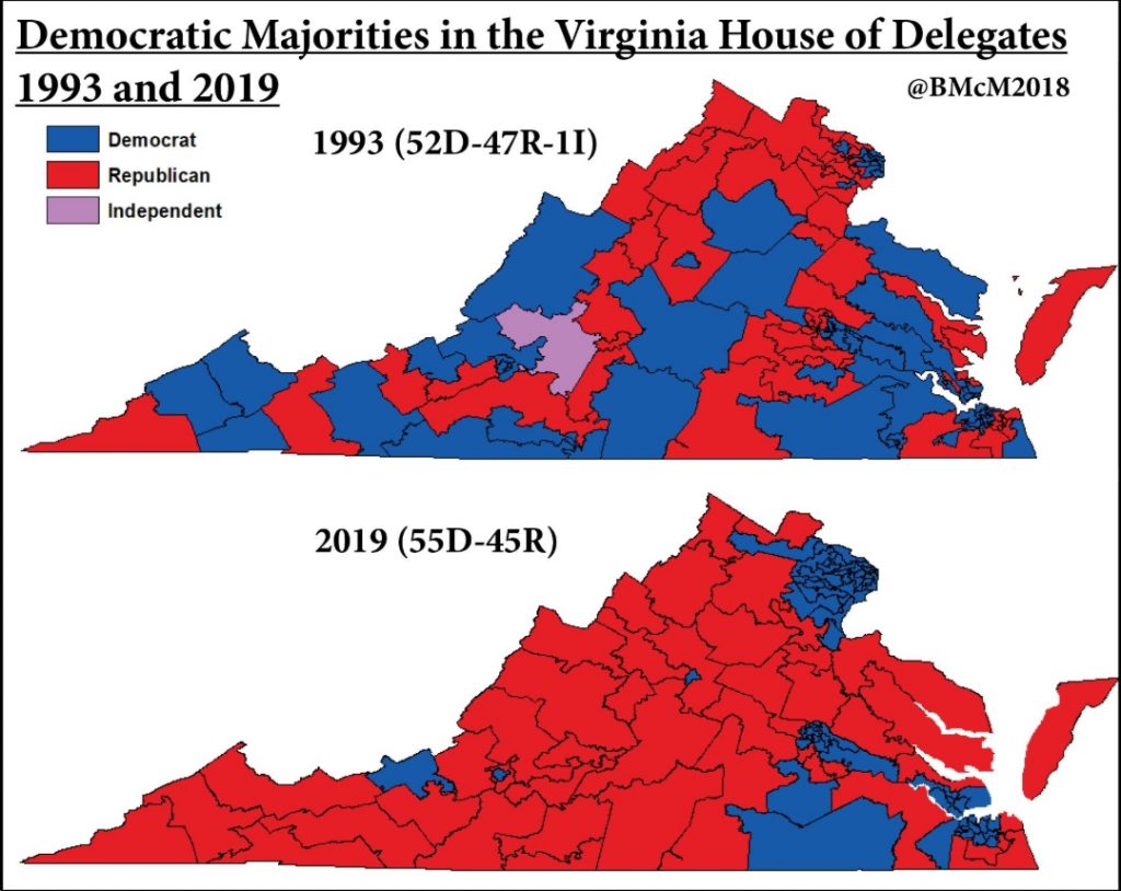
- The following maps show the entire state of Virginia in 1993 and 2019. Check out how “geographically different the 1993 Dem majority was in the state house compared to the 2019 post-election majority.”
- In 1993, as you can see, there was a lot of blue in Southwest Virginia, Southside Virginia, western Virginia and southeastern Virginia. Today, those areas are almost solidly red, whereas parts of Virginia that used to be red (e.g., in Northern Virginia) are now almost all blue.
- Also, check out the following tweet and maps showing Loudoun County moving from red to blue, as suburban areas move “hard against the GOP post-Trump.”
Loudoun County, VA has all or parts of 7 seats in the House of Delegates. Once red, it’s moved hard against the GOP post-Trump. Dem legislative candidates got 2/3 of the popular vote there last week, up from losing it 55/45 in 2015, & they more than doubled their raw votes. pic.twitter.com/USownvfjAt
— J. Miles Coleman (@JMilesColeman) November 10, 2019
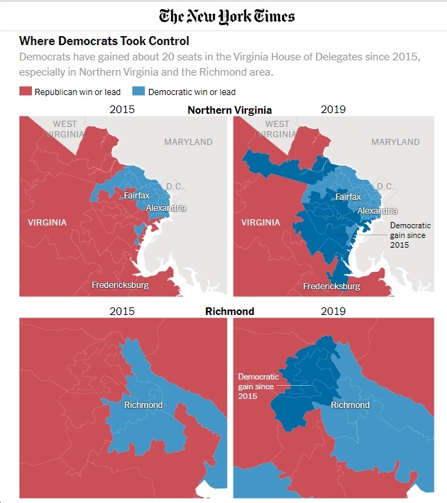
- And see the NY Times’ maps of expanding “blue” areas in the Northern Virginia and Richmond suburbs.

